Authors:
(1) Renato P. dos Santos, CIAGE – Centre for Generative Artificial Intelligence in Cognition and Education.
Table of Links
Conceptualizing chemical reactions
Deepening on understanding of chemical reactions
Question about a graph of gases turning into water over time
Question about the difference between atoms, molecules, and moles
Deepening on the concept of mole
Question about changing of state
Question about an animated representation of water molecules undergoing phase changes
Question about plasma, a state of matter
Question about chemical bondings
Question about illustration of chemical bonds
Question about the essence of the type of chemical bonding
Limitations of the study and possible future studies
Author Contributions, Conflicts of interest, Acknowledgements, and References
Question about a graph of gases turning into water over time
P1: Look, this stuff of chemical equations, gases turning into water over time and all that always throw me off a bit. Could you show me this in a graph or whatever?
ChatGPT: Certainly! Understanding how reactant concentrations change over time can be visualized effectively with a graph.
For the combustion of hydrogen gas in the presence of oxygen:


• The concentrations of hydrogen and oxygen decrease.
• The concentration of water vapor increases.
Eventually, when all of the hydrogen and oxygen have reacted, their concentrations drop to zero, and we're left with a maximum concentration of water vapor.
To depict this, I'll plot a graph of concentration vs. time for hydrogen, oxygen, and water.
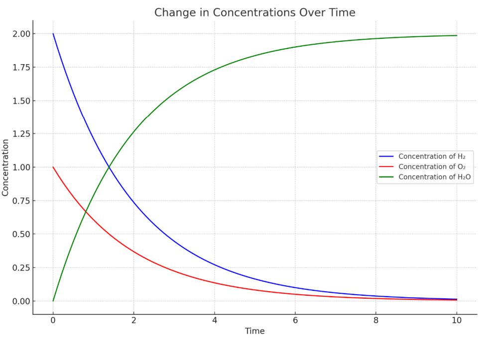
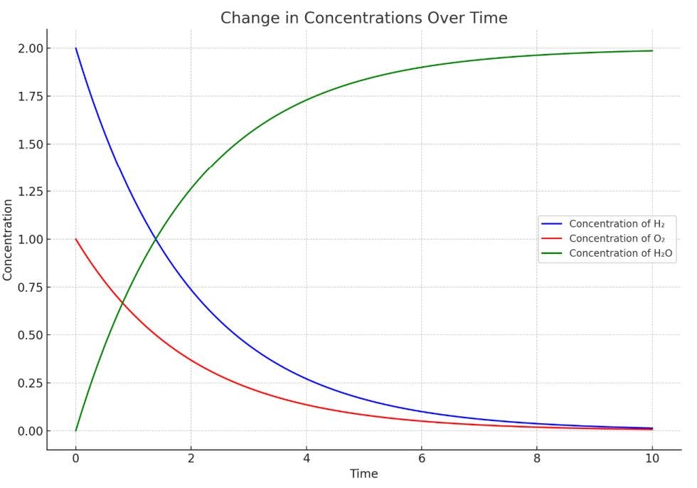
Here's a visual representation of how the concentrations of reactants and products change over time during the combustion of hydrogen and oxygen to form water:

This graph provides a visual way to understand the dynamics of this chemical reaction over time and how reactant concentrations decrease while product concentration increases.
Does this graph help clarify the concept for you? Would you like to delve into any specific aspects further?
BingChat:
Bard: Sure. Here is a graph of the phase changes of water:
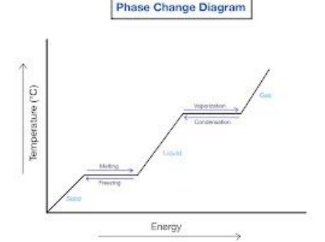
The x-axis of the graph is temperature, and the y-axis is pressure. The three different lines on the graph represent the solid, liquid, and gas phases of water.
The solid line is the melting point curve. It shows the temperature at which water will melt at a given pressure. For example, at a pressure of 1 atmosphere, water will melt at 0 degrees Celsius.
The dashed line is the boiling point curve. It shows the temperature at which water will boil at a given pressure. For example, at a pressure of 1 atmosphere, water will boil at 100 degrees Celsius.
The triple point is the point where all three phases of water coexist. It is at a temperature of 0.01 degrees Celsius and a pressure of 0.0060 atmospheres.
The critical point is the point above which water cannot exist as a liquid. It is at a temperature of 374 degrees Celsius and a pressure of 218 atmospheres.
To show the process of water vapor turning into liquid water over time, we can use the following graph:
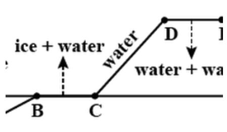
The x-axis of the graph is time, and the y-axis is temperature.
The graph shows that as time goes on, the temperature of the water vapor decreases. Eventually, the temperature will reach the dew point, which is the temperature at which water vapor will condense to form liquid water.
Once the temperature reaches the dew point, the water vapor will start to condense to form liquid water. The temperature will remain at the dew point until all of the water vapor has condensed to form liquid water.
I hope this helps to clarify things. Please let me know if you have any other questions.
Claude*: Sure, visual representations can often help make these chemical concepts more clear.*
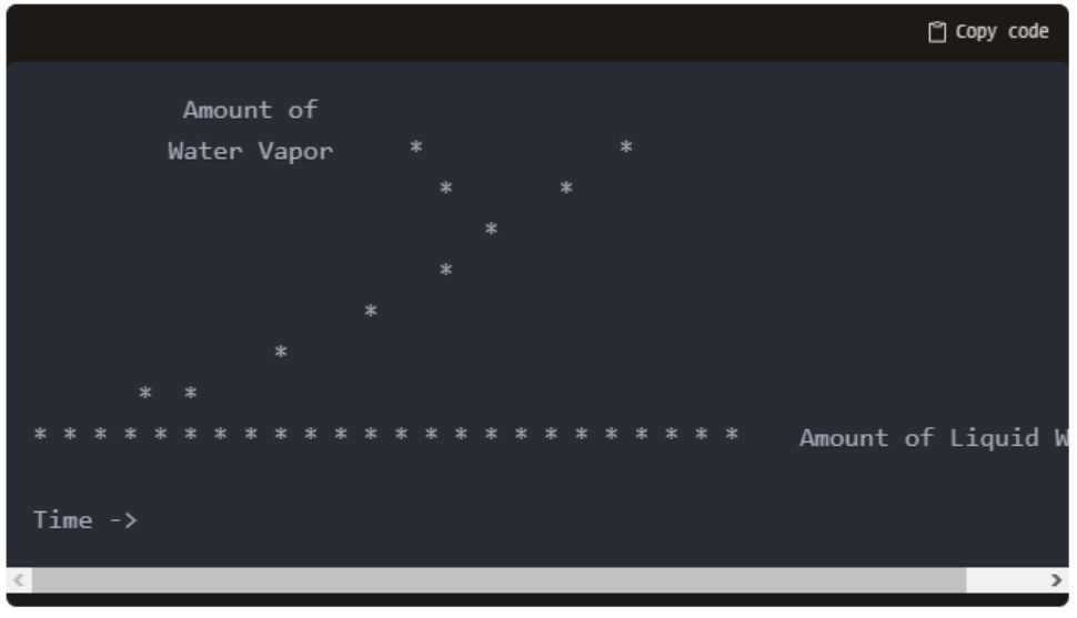
Here's a simple graph that could demonstrate water vapor condensing into liquid water over time:
 *
*
In this graph:
• The x-axis shows the passage of time
• The y-axis shows the amount of water vapor (top line) and liquid water (bottom line)
• At the start, there is a large amount of water vapor and minimal liquid water
• As time passes, the water vapor condenses into liquid water
• So the vapor line trends downwards while the liquid water line trends upwards
• At the end, there is no more water vapor left - it has fully condensed
I could create similar graphs to show the concentrations of reactants decreasing and products increasing over time for any chemical reaction. Let me know if a visual like this helps explain the concept! I can also work on more complex graphs depicting reaction rates, equilibrium etc. if helpful.
At this point, the student asked the GenAIbots for a more detailed illustration of these concept. In response, ChatGPT effectively leveraged its Advanced Data Analysis mode to provide a graph that directly addressed the student's inquiry, elucidating the dynamics of the exemplified chemical reaction over time, demonstrating excellence in the Instructional Strategies and Detail Depth & Content Recommendation categories. Its graph showcased the decline in reactant concentrations alongside the rise in product concentration over time, making it highly relevant and pedagogically valuable.
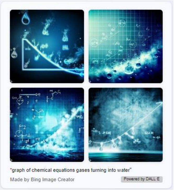
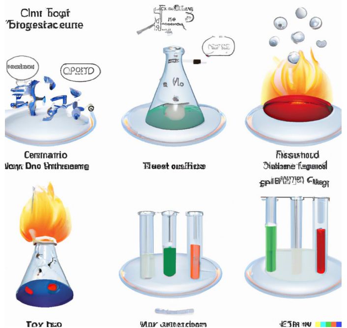
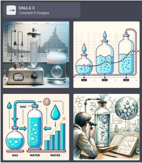
Conversely, BingChat, despite having the advantage of direct access to the DALL-E 3 image generator (David, 2023), failed to provide a personalized response to the student's request. While the generated images might have been undeniably high quality, the lack of direct relevance to the student's question and the generic nature of the images suggests shortcomings in the Personalization & Personable Touch and Instructional Strategies categories. Despite this, this integration is a welcomed step forward, particularly when reflecting on the limitations of the standalone DALL-E 2 version in tasks like lettering, as it is evident in the example below that resulted from the student asking Bing Image Creator to illustrate the concept of chemical reactions.
Lacking the capability to generate images, Bard showcased its adaptability by sourcing available online images that depicted graphs of water's phase changes. However, this method inherently risks not being precisely tailored to the question at hand. Even though it might have tapped into Detail Depth & Content Recommendation, the reliance on pre-existing content might not always be the most effective way to address specific inquiries. Claude did attempt to employ Instructional Strategies by executing an internal code to generate a graph showcasing the dynamics of the chemical reaction over time, but the visual representation was of inferior quality, possibly confusing rather than clarifying, and weakening the effectiveness of the Engagement & Interactivity and Use of Analogy & Comparative Illustrations categories.
It is worth noting that DALL-E 3 is also integrated into ChatGPT (Metz & Hsu, 2023) but as a distinct mode separate from the Advanced Data Analysis mode utilised in this session. To access its capabilities, the student would need to initiate a new chat session in that mode and reiterate the question. However, the images produced in this mode would be much more closely aligned with the student's query, as seen below.
This paper is available on arxiv under CC BY-SA 4.0 DEED license.

